BRITTcare has found a new course through a complete positioning process. Clarity in purpose created. Brought from product thinking to brand thinking. A strong brand identity and brand story have ensured that the brand foundation is in line with the business strategy. An improvement has also been made to the BRITTcare product label(s). Resources such as the website and packaging are now an automatic consequence of this branding strategy.
The mission: making washing without water available to everyone, is also well communicated and is the driving force behind the impact that BRITTcare wants to make in the world.
A number of expressions on which the BRITTcare logo is used. This shows the flowing lines, which are an abstract form of the Brittowels.


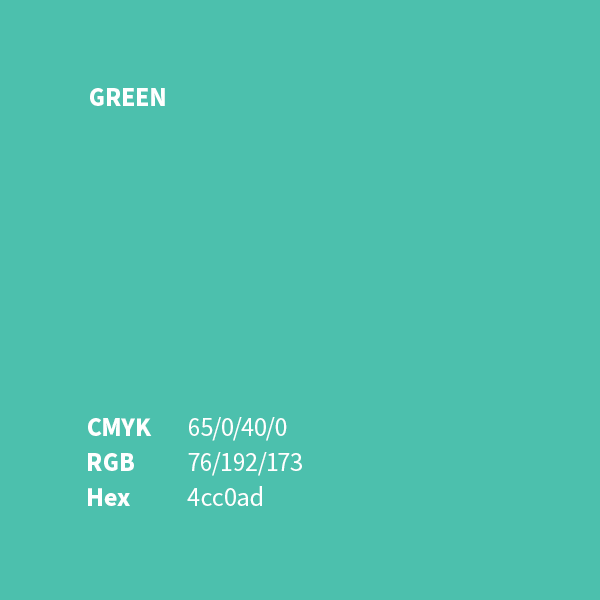
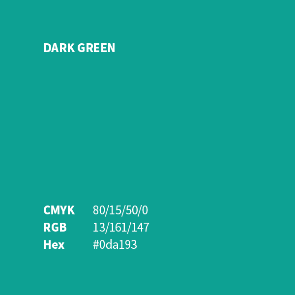
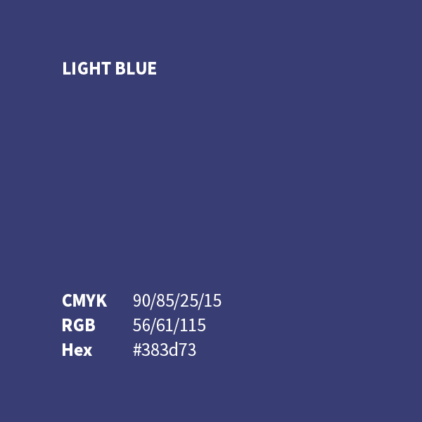
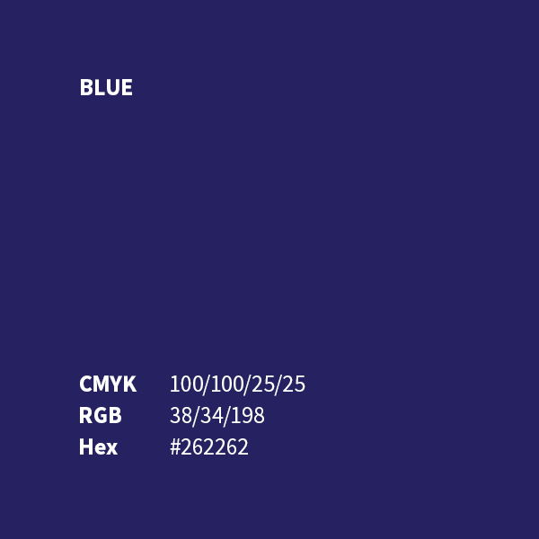
The main colors of BRITTcare are green and blue, which is always used for the logo.

“I am very happy to have entered into a partnership with Alterego. They taught me, as an entrepreneur, to take a good look at my own company. But also to myself as a person. The question: why I ever started for myself and now do what I do, but more importantly, whether I still chase those dreams I had then. This collaboration has resulted in me being back on the path I want to follow. I have entered a new phase and they have adapted the identity of my company accordingly. There is now an unambiguous powerful brand with a story. Definitely recommended to get started with Alterego!”