What could be better than working for a company with a sustainable mission, guts and endless energy? The question was clear; develop a strong brand with the existing brand building blocks. Food&i knew who they are, but capturing that identity in concrete texts and images had previously failed.
We went in search of the essence of Food&i and managed to capture it in a strong brand manifesto.
Because Food&i = You&Me = Pure&Local = People&The planet = #JOINTHEFOODREVOLUTION
The brandmanifesto is the coat rack for all Food&i communications and because there has never been a silent revolution, we have added an important building block. More about that below.

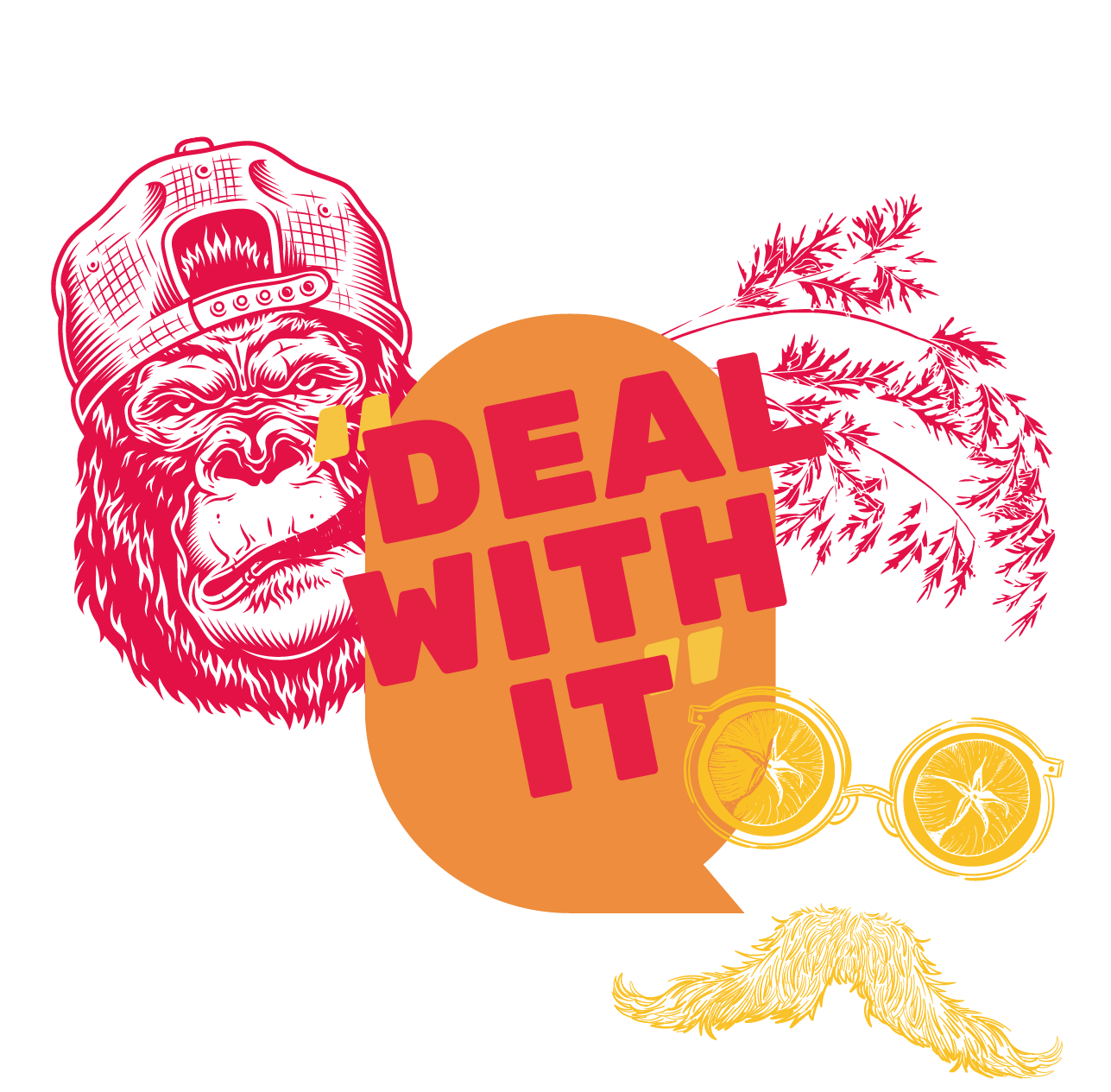
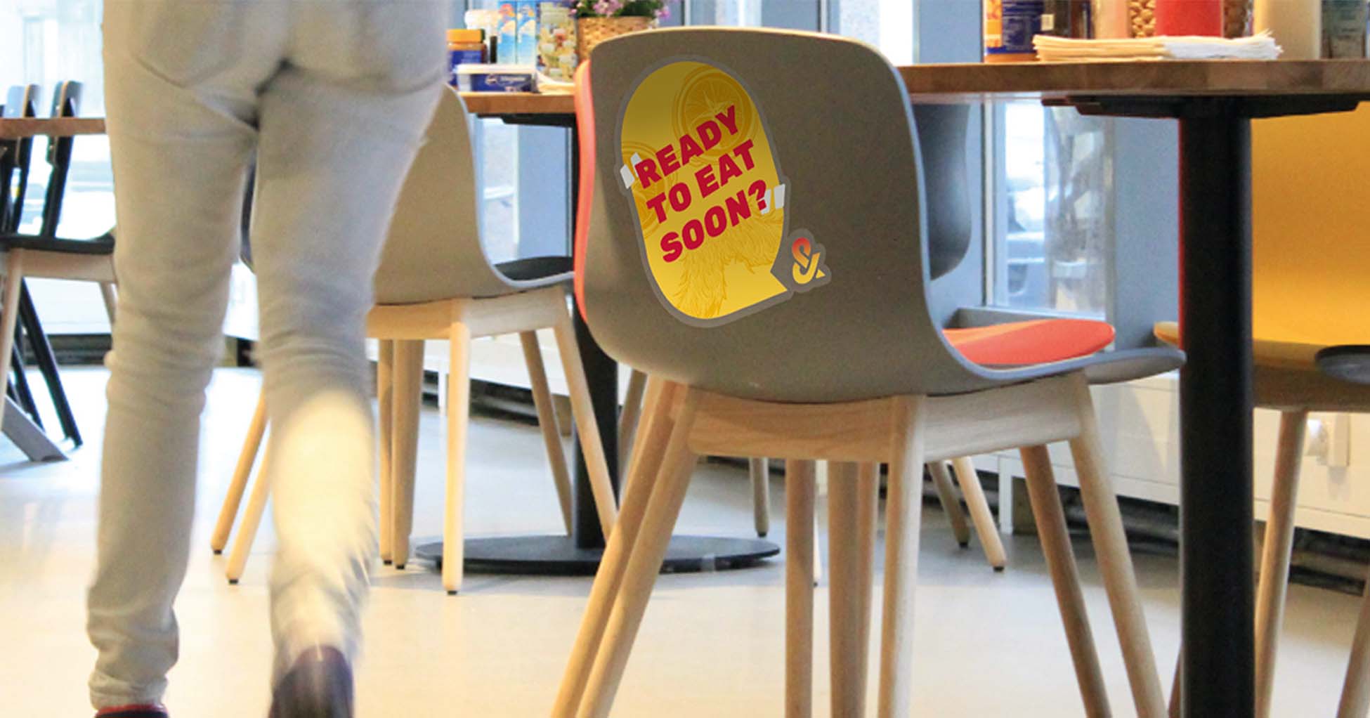
To give more power to Food&i’s Food Revolution, we have isolated the striking ‘negative space’ from Food&i’s O to use as a Callout Box in which we work with fun grotesque quotes related to health, convenience and sustainability. With this we actively inform everyone who comes into contact with Food&i about the mission of Food&i.
Food&i already has a set of great brand building blocks (yes, there they are!) such as a selection of main colors (grey, yellow, orange and red) that fit perfectly with a revolution, two stubborn, cool illustrations (which we will be expanding shortly) and a bold font. By adding the Callout Box and the CTA #JOINTHEFOODREVOLUTION to this, we have created a toolkit that is perfect for shouting from the rooftops!
We have found a way to make a homogeneous whole of these existing and new design elements and to process this into a package of basic patterns for Food&i’s expressions. Think of posters, flyers, tenders and narrowcasting that the Food&i communication department can use itself.


